
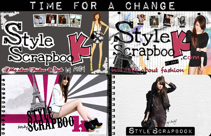
In the almost 4 years that I have been blogging, I have had around 6 or 7 different banners displayed on the blog, unfortunately the very first ones I used are nowhere to be found in my archives, so these are the only 4 that I could find.
I have been longing for a change for months now and since I ‘ve been blogging for such a long time, it sometimes I feel like a change is inevitable.
A lot of people always tell me that I should change to a white background, the problem is that I started with a black one, so now, changing to a white one seems very drastic, although I must say, I have considered it way more than once.
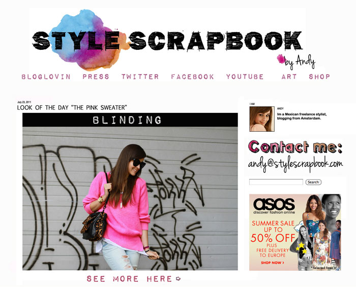
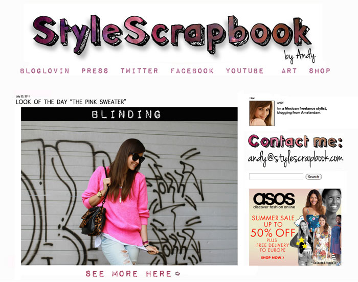
I want my new banner / Layout to be fresh, simple and chic and the more I think about it, the more I get convinced that a drastic change is exactly what StyleScrapbook needs, a fresh new start.
Last night I was trying to put all these ideas into a design and although a lot of you will be very shocked to see this huge difference, I want you to be open to new possibilities, at the end of the day, I want to include you in my decision as much as possible since its YOU who gives me the honor of visiting the blog, so for me, its crucial that you like what you see.
I am still open to ideas and suggestions and if you have killer graphic design skills and a completely different idea, I would be more than happy to see what you have in mind. Email me at [email protected] and share your thoughts, maybe we can even put all the new banners for a vote and let everyone choose :).
Traducción:
En los casi 4 años que llevo con StyleScrapbook, he tenido al rededor de 6 o 7 banners diferentes y siento que ha llegado la hora de un cambio radical.
Muchísima gente me dice que deberia cambiar el color de fondo a blanco, pero como ya llevo tanto tiempo con el fondo negro, siento que el cambio se vería demasiado drástico, aunque eso no quiere decir que estoy cerrada a la posibilidad, lo he y lo sigo considerando.
Quiero que el nuevo banner / Diseño sea algo fresco, simple, chic y mientras mas lo pienso, mas me convenzo de que un cambio radical es inevitable.
Ayer en la noche estuve tratando de poner todas estas ideas en dos diseños diferentes. Se que a la mayoría se les va a hacer un cambio my radical pero me gustaría que estuvieran abiert@as nuevas posibilidades, por que al final de cuentas, ustedes son gran parte de este blog ya que son los que me dan el honor con sus visitas diarias, así que para mi, es importante que les guste lo que ven.
Si algun@ de ustedes tiene otras sugerencias o que mejor, sabe de diseño gráfico, estoy abierta a mas ideas y sugerencias. Me puedes mandar tus ideas a [email protected] :)

244 Responses
Me gusta este look, el mismo lo hay en el catalogo de Blanco
I love them both but the 1st one is a lot better :) … How did you create them!? [email protected]
definitely number 1!! i'm excited to see the changes you decide on and i'm loving the white :) xohttp://dressedupallligators.blogspot.com/
me gusta la idea de que no sea un cabezal tan alto, mucho scroll…y el blanco para mi es mejor para leer…ambos son lindos por cierto!
yes I think you should definitely change to a white background, and for the banner I think that you could come up with something better, more creative, is this your actual handwriting or is it a font from internet? I think for your personal blog you should create the type yourself, also a collage of your photographs would be quite appealing, Im going to change my header in the next moth or so, if you need any help I could create you few designs :)http://vasare.wordpress.com/
andy! me gusta mucho el de la mancha de pintura y luego stylescapbook! se ve muy simple y chic! un beso
the first idea because the banner is nice
En mi humilde opinion, momento adecuadisimo para que "style scrapbook" sea convierta en imagotipo, logo o similar. Vaya, mas allá de dos palabras creo que es una marca/concepto… just an idea…
Mi humilde opinion: un logo para el "style scrapbook". Ya no son sólo dos palabras, mmm digamos que es tu marca???? Creo que valdría la pena darle personalidad a ese nombre…
I really like the first one!! It looks awesome and has everything you were talking about. Great job! I'm actually wondering how you did this with blogger? Do you use illustrator or photoshop? Or is there some other secret and amazing thing out there that I have yet to find out about? If you can, it would be wonderful to know!Thank you!Victoria Mariehttp://victoriainjapanland.blogspot.com
FIRST!! =D
FIRST!! =D
As for me, the banner that you have now looks more professional than the others. You deserve the more professional one :)
andy creo que el nombre del blog deeria tener mas cosas recortes adornos yo que se… de eso se tratan los scrapbooks :)
HeyyI visit your blog for one year, and yes i think it will be better in white eventhough every blog are white. Pictures are more visible. So I vote for the first one, but I will prefer a banner with a picture of you or something not simple the name
The second one is definitely not!!!! The first one more interesting. And i think you should also change (if it's possible) the icon of your blog as it seen on tabs of browser. Cause now it's that white "B" on orange background of blogger.com. And i think it's about the time to have your own logo as all "big" blogs have, because you are one of them.P.S I also think the black background a little disturbing and hard to read, so white is a good idea.Katia
I think first banner is better ;) But I like both.
Hi AndyI think it is good that you leave the black backgrund color behind and go for the white one instead. Your photos will pop!. But I think that you during these 4 years have grown out of this rather unsophisticated scrapbook-feeling. I know that the scrapbook is your concept but you can keep that without being childish and instead be more sophisticated. Even your personal style has become more sophisticated so why not show that in your blog design as well. I would suggest to not use the cutout-style fonts and go for some real nice sophisticated ones instead. As in my theme I am sure that you can use different fonts for different things and it gives a nicer feeling to it. Just leting you know how I feel about it since you put it out there =)An looking forward to seeing the final result.Kind regardsJennifer
The first one is just amazing. It´s fresh and easy, but also very beautiful :)xx Marahttp://glitzerglanz.blogspot.com/
I think that the one in the bottom left corner would be well suited. Those wedges are simply amazing and so is the rest of the outfit. I think this banner is very fitting.:)http://tinavoila.blogspot.com/
i like the first one!
DON'T change to white PLEASE! there's something about white background blogs that make me wanna close them :( i mean…of course the content of your blog is way more important…but the white is just not soo..stylescrapbook. but i love the font and the colour blot in the first layout :)
whatever you choose i'd still follow you anyway andy.. i love you.. ♥
stick with black! I agree with the others that it represents you more. although the first screenshot is nice :)x,V Pantaleon
Me encanta el segundo ♥
I love the second one because of the font. It's cuter. I personally think you should keep the black background becuase most other bloggers have the white background. Then again I sorta like the way your going with the new look of the blog.
The first. ♥
White background is way too better =) And I loved the 1st idea.
No cambies a fondo blanco por favor! La gran mayoría de blog de moda tienen fondo blanco. No caigas en la trampa Andy. No caigas en la tentación.El fondo negro es tan tuyo! realza más las fotos que posteas, realza más los colores. muchos éxitos!
Me gusta el primer banner pero con el fondo negro!! Es un clásico, sería raro el cambio! besin, prihttp://laspalabrasjamasalcanzan.blogspot.com
I love the first one! :)
Love the first one!!
i really like the first design! i am excited to see what everything looks like in the end :)
EL PRIMEROO!!
wow que sorpresa leer que a muchos les gusta el fondo negro!! porque a mi hace mucho tiempo me aburrió!! será que me cansa la vista o ver siempre lo mismo.. no sé (soy una de las que te dejo comentarios acerca de cambiar el fondo alguna vez).Renovarse es genial. La clave es cambiar por algo que realmente te guste a vos, al fin y al cabo a muchos les gustará y los que no estén convencidos se acostumbraran, porque te visitamos por el estilazo que tenés.De los dos que propones me gusta más el primero. Por lo menos yo estaré feliz de ver un fondo más claro!!En mi opinión lo que te diferencia de los demás bloggers no es el fondo negro, lo que te diferencia sos vos, tu personalidad, tu impresionante buen gusto, la calidad impecable de tus fotos y tu pasión por lo que hacés. Mi consejo, es que no dejes que te condicione para nada eso de que "el negro es lo que te hace diferente".. no lo veo tan relevante. Un besote.
El fondo blanco se ve más limpio y el primer banner está increíble :)
Me encanta el segundo, es mucho mas fresco y lindo ♥
I love the first example a lot! Clearly you are one of the top fashion bloggers and your outfits are so unique and that sets you apart from the rest but I feel that the new layout mirrors almost every other fashion blog out there. ( I have to admit mine is white and I have a simple header) I've actually admired that you have kept your background black, and have loved your banners.It's understandable that you want something more polished and chic. I think whatever you decide will be great but I just thought I would tell you my opinion and I love your blog the way it is!Goodluck! I love reading your blog and am always excited to see your outfits you put together :)
very good idea … changes is always good :) http://rocknrealprincess.blogspot.com/
Hola, Andy, wow, esto es raro, es la primera vez que te dejo un comment (love ur site, but im a lazy lady ;)y es que en vdd al igual q otras readers considero que el negro es lo q caracteriza tu blog, ya habemos muchas/os en blanco y el tuyo simple y sencillamente se siente como entrar a nuestro propio closet a buscar inspiracion… creo q lograrias algo muy interesante aun dejando el fondo negro.Anyway, elijas lo q elijas aca nos tendras…venimos por tu estilo y el diseño solo es la cereza del pastel!!Kisses desde Mexico!!
hola Andy! :)Pues la verdad que a mi, personalmente, me gusta más de los blancos el primero :)la verdad es que a veces necesitamos un cambio radical en nuestras vidas, asi tenemos un soplo de aire fresco! jajajaespero que te vaya todo muy bien y que encuentres lo mejor para tu blog! :) jajajaun besitoo!(K)http://livelymixture.blogspot.com/
i like this firsthttp://yingsaranporn.blogspot.com/
I'd say the first option, only I would change the 'contact me' font into the same font you used for the banner. That would make it more a cohesion (:
No puedo negar que el fondo blanco se ve increíble…pero por otra parte la mayoría de blogs tienen ese color de fondo.El negro es muy Style Scrapbook!
Estoy deseando ver el nuevo!Creo que todos han sido perfectos para cada etapa de StyleScrapbook! Los dos últimos, los mejores y más sofisticados! A ver con qué nos sorprendes!http://somestylestories.blogspot.com
Para mi opinión el primero es la mejor opción, ya que es más simple y fresco que el segundo, de todas maneras prueba a ponerle algún tipo de marco algún detalle más que lo envuelva o por la esquina derecha y que siga hacia bajo como si fuera una especie de vinilo o algo así, ya que igual el cambio tan drástico como dices del negro al blanco te cansa muy rápido ya que el blanco acaba aburriendo un poco..Aunque dicen que en la sencillez está el gusto, asi que igual lo pruebas y te llevas una grata sorpresa y te encanta!Si no arriesgas no ganas.. todo es arriesgarse y probar!Me encanta tu blog, mil besos!
oh wow that is so different! love the 2nd one! X
the first!
wow! I LOVE IT! :D I think the first one is my favourite! no need to be afraid for such a great change! good luck :D xoxo
the 1st 1. But we'll miss the black all blogs have white backgrounds
Andy :)Me encanta el banner de la Torre Eiffel de la primera foto, lo podrías poner y poner el fondo en blanco y las letras en rosa.xoxo
I actually like the black background it's different from all the other fashion bloggers almost everyone of them got a white background. But White would be nice for a fresh start.
El primer banner me encanta. El fondo balnco no está mal, pero prefiero el negro porque es característico de tu blog. En serio, si me dicen "Nombra un blog que tenga el fondo negro"…creo que solo se me ocurre el tuyo, y eso, a mi parecer, es bueno, muy bueno.
I prefer the first one and I think a white background is a great idea!I also think it should have a picture of you instead of just having the name of your blog.I look forward to see what the readers will come up with.
I personally prefer the second one but whatever you are gonna change I will always follow you :))
Both of them are nice, you should put the frist one & when you want to ghange it again you should put the second one :) XX
De verdad, muchas gracias por modificar la entrada, era bastante ofensivo para la inteligencia.Fantastico el estilo por cierto.
Andy me parece super padre tu blog,pero tienes razon estaria muy padre que lo cambiaras a blanco, pero para ser sincera el blanco me parece genial para Primavera-Verano, podrias considerar un color oscuro para Otoño-Invierno :)
LOVE THE FIRST! WHITE BACKGROUND WILL BE AWESOME!XX
Both designs are great! But I'd take the first one :)
I love both actually, but the first is really bold and striking. I love it.http://fabfixation.tumblr.comhttp://quenchfab.blogspot.com
I love the white background! But i think the banner should be the first one, with a picture of you (similar to the old ones- but eith only one pic)The first idea of your banner is really cool though! =)Giulia
i love black background!
I have to say that I really much enjoy the black background, I think it's some kind of proper style of your blog. But with the two backgrounds in white, I really much enjoy the first one!XOXO
hi andy!!personally i prefer the first one. althought i associate the black background with you, it could use some change too, sometimes its too much, too heavy. but you dont have to change it to the opposite, try some different greys (dark, light), or maybe some purples, since you love purple :)
en mi opinion lo veo muy bien así!
White? Noooo, Andy! Don't do that. Okay, you decide, but almost every fashion blog has a white background :/
The white background really is great if you want a fresh start. Also black can really look a bit depressing in my opinion!I love the 1st banner you designed! It really looks much better with a white background!Emily
I like the first one best!
I like the first one best!
Estoy de acuerdo con Sina, muchísimos blogs tienen el fondo blanco y el negro es algo muy característico tuyo.En cuanto al banner, me encanta el que tienes, en cuanto lo ví la primera vez que lo pusiste pensé que era perfecto…pero si lo cambias definitivamente debería tener una foto tuya! (que se vea de quien es el blog!)
Oh yes, white is definitely better! Way better! I think a banner very very simple, with no shadows or colors at all with be very chic. I like the minimalism idea and I would go for something like Hanneli Mustaparta used on her blog. It is very simple but yet so chic. Anyway, can't wait to see the new layout and all the changes you are going to make :)Hugs Andy!You rock the fashion blogging world
I like the 1st one best. I don't mind your black background, I'm used to it by reading your blog, and I somehow connect you to it. I think it makes you stand out from the other bloggers who use a white background. But if you want to change it, it's ok, we'll get used to the white one as well.
I think 2nd is better;)gorgeouslook.blogspot.com
I like the banner you have at the moment ( much more than the one you had before that )… but the first one you came up with now is very cool aswell ! smaller and simpler , but then the focus is on your great posts ! Curious to see what will be the endresult http://www.tripsandtreasures.blogspot.com
me encanta eso de cambiar el diseño del blog! vivo de cambios! jajajaMe gusto el primer diseño!^^besitoswww.tastemycloset.blogspot.com
I prefere the first one out of the two. I am a minimalist, so I really like just text on a clean background, black or white. I like the sketchy details in the first one, hence "scrapbook" :)http://mostlyclothes-cristina.blogspot.com/
I'm so used to the black background; just recently I was thinking how much I like that your blog is different. Somehow black makes it cozy and unique. But I'll still love your blog with any background, be it white, yellow, or purple :) .
I like first white background and i like your black background but i think the most important is your style and your outfit.
a mi me gusta el de arriba!…check my blog, I just started and will love your opinion…plus I've featured you in some posts :)Besos desde Monterreymexbiuri.blogspot.commwah!
changing from black background to a white one will make the blog more appealing, and my sister designed my new banner you can check it out http://girlynote.blogspot.com/
So many blogs have a white background, and I think it's great yours is black because it makes you stand out in my mind. Why not go with a black and white header, with maybe a pop of neon colour (eg. magenta or turquoise) and "Style Scrapbook by Andy" written in a cursive, bold font? Of course, the decision always comes down to what you think is best and I'll still be here following regardless of what background/style you decide to change your blog to :)xx from Montreal,Sarahwww.ibleedfashion.com
i think you should change to the white background. it looks clean and simple and reading white letters on a black background is not very comfortable to the eyes. and pictures look so much nicer on a white background. i like the first version really much, the second looks a little bit childish in my opinion.
Amo cambiar el diseño de mi blog todo el tiempo buscando uno perfecto, creo que lo encontre ayer…A mi me gustó el primer banner! los dos son hermosos igualmente! kisses from Argentina!
I would go for the second one. The first one is really cool and creative, but a little messy. The second one is cleaner and more defined.
I really like the first one.xoxoxohttp://onemoreaddictioninmyworld.blogspot.comhttp://onemoreaddictioninmyworld.blogspot.comhttp://onemoreaddictioninmyworld.blogspot.com
definetly the first one. love the idea of a white background
Me gusta más el primero, aunque sí me gustaría más que hubiera una imagen tuya en el banner.De todas maneras tampoco importa tanto el look si el contenido sigue siendo así :)xxx
I love the first!me encanta el primero!♥http://quemepongobyalbavila.blogspot.com
Me gusta más el segundo diseño, con el texto en print galaxy. Y claro, ya puestos a cambiar, que se note! =)xoxo
i love the first one ! :Dhttp://japobsganbare.blogspot.com/
definitely the first!!Love you xxhttp://sellerstyle.blogspot.com/
I really love the first choice! Your blog will look so good and fresh in white.
LOVE the first banner with the white background! :) xx
nomber 2 http://mode-24h.blogspot.com/
I think you should turn it white and put a collage of the drawings your fans sent to you as banner!
Hola!!!a mi em gusta el que tienes ahora!!esta bien los cambios, y además los haces porque quieres, peor muchas veces cambiamos por cambiar y la esencia es con lo que comenzaste, no se, es como el logo de Zara por ejemplo(nunca ha cambiado).si eh de escoger entre estas dos escogería la primera, auqnue el segundo también es muy chulo.Un besazo guapa.
I quite like the first one.
I lvoe the first banner, I love the font you are using. White is great..
ayer justo dejé un post hablando de los banners!!! jajajajaja que gracia.Me gusta el primero, pero cambiaría el diseó de las letras, el toque de la manchita es muy chic. Eso sí, prefiero mil veces el fondo negro, casi todos los blogs de hoy en día son con el fondo en blanco.El tuyo es diferente, el negro es mejor. Un besito.
I love both but I have to say the first one is my fave :)xoxo,http://fashiondollhousee.blogspot.com/
I like the first one very very much but in my opinion it would be nice if the "contact me" was in the same font as header's:) http://www.kketsuu.blogspot.com
I absolutely love the white background! It's to die for!!! :DYours Truly,Stefanihttp://www.stefanideleon.com
loveee your banners!Bises,monkeyshineshttp://monkeyshines-monkeyshines.blogspot.com/
love all :)pinklemonincrystal.blogspot.com
the first white idea is great :)
I do not really like the change, seems to me that diverges from your original style, a change is good but without deviating from what really difference you
We prefer white backgrounds rather than blacks, although we'll keep on following you whether your background is black or white ! We do like your blog, it inspires us a lot :)Kisses from http://www.bpeinternational.blogspot.comMiladies**
The first one is my favorite! I like the type you used on that one more, more scrapbookey :Dhttp://www.closet-fashionista.com/
go with the second one! and yes white is superb!but the font should be as usual. the comment's font now is hard to read =(
The second idea is really great, although it's very different from what you have now. I would pick that one, it's simple and cute :)fashionthroughtravel.blogspot.com
me quedo con el primero!! me encanta el tipo de letra…..y el acento de color… Exitos bella :) xoxo
El segundo me gusta!! Yo también creo que es mejor el fondo en blanco!! Que ganas de ver el nuevo banner! Un besito Andy!
I think a banner with your picture would be better ! I always liked your big banners! white background would be great !!!!
I like the first one:)Love your blog Andy!
I think both of the new layout possibilities look great, and I definitely think a white background looks better! Very fresh & clean!
I like the first one! It's fresh with a touch of Andy
I like the first one! It's fresh with a touch of Andy
I also like the first one better. The second looks a little bit more childish. Sweet- but I think you would get rid of it soon… It doesn't matter what you do, the content is YOU and that's why we're here :-)
I think the first one is lovely Andy :) !
the first white background is really beautiful I like it a lot! :D
I don't know why do you want to be like everyone else!!! You are who you are with your black backround and that's why we love it/you! And the banner, the first one is better. ;)
Sorry if you misunderstood me.. I apologize!! I think that it is great that you wanna make a change.You ask for our opinion and I just said what I think. Anyway I will read your blog whatever it looks. It is true that the person behind the blog is the most important thing!! I just wanted to say that your blog is amazing because of you and because of the design you have been chose. So I'm looking forward to see what is coming next on Stylescrapbook!! Love you! And sorry again!! <3Desislavahttp://truedreamcatcher.blogspot.com
the first new banner is amazing love it!but the black background is a piece of the blog so i say not to change it!xoxo eva
less drastic: A grey background!no I'm kidding. If I think of stylescrapbook I think of a black background (not only that ofcourse haha). But I really like the first white option, and there is nothing wrong with change ;)
I love the second one :) xo
The first white background is really cool!!! I mean, the black background that you've had until now makes your blog different from the others and at first I thought I wouldn't like a white background but hey, it is really really cool! So if I were you I would go for it and change it!
I love the first idea. And going for a white background is a great idea !Good luck with everything ;)
i really love the first banner, and yes, white is better!love your blog. xoxo
i'm thinking the first one ♥http://missmollyfashions.blogspot.com/
i think a new banner and the white bg is an amazing idea! BUT! I don't think that one of those two banners fit to you.. I would miss u in the banner so I think there have to be a picture of you in the banner, otherwise it's not personal and not you.. Hope you'll change your mind ♥Lisa
La primera es chulisima, pero entonces tendrías que poner el blog en color blanco ¿no? a mi me gusta con el fondo negro, asi eres más original, pero seguro que blanco también estaría bien. besos guapa
I really like a white background, but if you look closely you can see the white you used in the background is different from the white you used for the banner. Just a tiny little detail you could change to make it better. BTW really like it! It's fresh and new. And if you had to choose between the two banners, I would choose the first one, although I think the second one is more 'stylescrapbook'. You know what I mean?Love, Laura
I like the black background more, but if you like I could help you out with stuff for your blog :) I made my own as well and I made Charlotte's (twopeas-inapod.com) header as well.
the first one looks amazing! You have to do that one…. XX
I love the first one!!! <3
the 1st white backround is really cute and I love it the most
me gusta más el primero, la idea de cambiar el fondo y ponerlo blanco me parece genial porque da la sensación de más amplitud.espero ver un gran cambio!un beso. elena :)http://thecollagelife.blogspot.com/
Really like the white backround and the first header!
I prefer the first white background! It's more 'style schrapbook'I absolutely do like it if you gonna change to a white background, it's just fresh! :)
la primera me encanta!!!!
I like the white background
White background.. and a new font! What about "trebuchet ms"? Clear and easy to read. Besitos :)pao;
i like the first idea for the new banner…http://addicted-to-all.blogspot.com/
por cierto!!! si elegieses la primera idea, yo creo que pondria el contact me con el mismo tipo de letras que el banner, para que quede todo más unificado
everyones a sucker for the little watercolor splash on the first one, me too :P
lo cierto es que el negro es un parte de la identidad de tu blog, pero si lo cambias tampoco quedaría mal, y al final nos acostumbraríamos como pasa con todo.En cuanto al banner, creo que las letras solas quedan mucho más elegantes que si pones una foto, y la primera idea, con el tipo de letra y todo creo que queda mejor pq me recuerda al tipico cuaderno de notas, y con la mancha de tinta queda genial :D
LOVE the first banner sooo much!
love the last one!!! perfect colors! :Dthe banner are gorgeous!sweetdifferences.com
First one looks more like your style!! xx
first one!!
Andy! A mi me encanta el fondo blanco y el 1º banner con la mancha! Super bonito!www.blesstheit.blogspot.com
I think it would be better to have a white background and i would choose the second banner :)
I really like the first one! Yes, it is different, but certainly in a good way!
I love the first banner.And a white background would be so much better.
I like the first one more. It got my attention more rather than the second one which I almost didn't notice at all. And I like the white background. Looks much more pleasing in the eyes :)
I love BOTH the white layouts Andy. Quite simplistic and easy on the eyes, but it still has your personality. I must say I prefer the first one , but there's still room to improve the blog design. I think you should really take it modern and new and less "amateur-ish" You are one of the world's most famous personal style bloggers so I think you should improve on making it look professional. Of course it's for you to decide if you're losing your vision or not.stilodorito.blogspot.com
The first banner (:
I think the first one with the white background is AMAZING!
I think the first one is the best. However if you are going to choose that one the type face for the "contact me" section will have to match it otherwise it would look silly. Awesome though
I loved the 2nd!I know how difficult it's try a change of a layout.Recently I changed mine.If I have some idea I'll contact you with sure ;)kissesxxLilihttp://chicreaction.blogspot.com
The first banner is really nice! I think, the idea of a change is always good, so don´t be afraid of it :)( PS. I love the font! )
i like the first one!
The first banner is really nice! I think, the idea of a change is always good, so don´t be afraid of it :)( PS. I love the font! )
Honestly I like the black background a lot!! And I think that you should not change it, cause all blogs are with white backround and your is a different.About the banners.. I like the most the third one in the first picture, where you are sitting next to the Eiffel Tower. The new ones are cool, but a lot of blogs have similar banners… But this is just my opinion. I'll be glad if I help you :)))Desislavahttp://truedreamcatcher.blogspot.com
Really like the white background and the first header! Go for it!
the first one is so great! i like the white background and the banner as well :)
Ohh, love the white as well. So crisp and clean! Good luck finding your perfect banner! Have a great week! XO Rebeccahttp://raspberry-rouge.com
saw the first one and was like..that's a change I can't wait to experience! :)
i think you should stay with the black background, it's part of what makes your blog unique. i used to love your banner you had at the start.x
I love the new ones :)XOXO honeyhttp://lauralexo.blogspot.com
1st is better and it looks nice with white background. I'll think about your new banner and maybe I'll show you some propositions if I'll make somethingkisses
Love the 2 one
I like the first one with the white background, that's really nice and clean and fresh! You with the Eiffel tower is pretty too though, I love that :) http://www.raindropsofsapphire.com
I like the first idea for a new banner. Also the white background is a nice change!ilikelikingthings.blogspot.com
es muy diferente, pero personalmente me gutsa mas el fondo blanco. La verdad es que me gustan los dos banner, quiza más el segundo ;)Un beso Andy
i prefer the 2nd, i'd really like to see what other readers came up with :)
It's strange with a white background, because I always admired your blog being black from day 1 – however I do like first one you designed – I like the colour behind you name!! x
the first idea look very nice ♥www.myamericandr3am.blogspot.com
I always thought your current banner was simple & sophisticated whilst also identifying the blog as 'you'. I prefer the first banner but it's not got the wow factor like your current one – provably because you're missing from it! Xx
the first one is better but i still want a picture of you in the layout!
Me parece una idea genial y me encanta el primero de los banners, muy sencillo, pero con un toque divertido y fresco.
I love the first theme ;)
I agree that you should change the design for a simpler one, but maybe you can keep it black, you know there are very few people with a black blog, it changes to see a black blog sometimes :)You have a nice style and blog, congrats :)If you like French fashion, you should check out mine, and maybe follow me if you like it to be the first to know when I update haha ;)xxwww.coralieslooks.com – FRENCH FASHION BLOG
i like the first one a lot! it's really an improvement i think
I like the white! I really like the 3rd banner you're showing in your first pic! Fresh, chic, clean and simple! Besides that, the first lay-out seems very nice! XO Diannewww.highheels-nothingtowear.blogspot.com
Oh wow andy, just wow wow wow the white background is AMAZING.you HAVE to use it!x Camilla
please keep the black background!!! so many other blog have white background and i really love that yours is black!!!! it makes your blog even more special!!
I like the first one. Looks good!
the FIRST one is such a killer! its definitely CUTE :)
Number one is definitely my favourite and I'm right behind you on the white background! x
The first banner is cool, very different of yours but cool!xx
Popular fashion blogs like theblondesalad,fashionsquad, etc. are usually have white backgrounds. Yours is unique like this, if it is hard to read on black maybe you can try a more light color like grey or dark blue so it can keep its original and unique way. btw i really liked the first banner.
FIRST!!!respectmystyle.blogspot.com
me encanto el segundooo! saludos andyy:)
the first one is the best. love it!
Pongas el que pongas quedara chulisimo!Zepequeña.
I prefer the first new banner!But..I must admit that I prefer the black background: must of the blog's blackgroungs are white..keeping your black you can be different from all other blogs!But this is only my personal view! :)My photoblog: http://www.photographyforpassion.blogspot.com/
I like the second one, shadows in pencil drawing under the font type looks comfortable … nice design :)
i love the first one!xx**Check out my Stylish Confessions!**
I really like the first one; it looks fresh and accessible, especially because of the white background. The header is nice too, but I do think your current one is more special and more you. Good luck! xx
The first banner is beautiful!I love your blog with white background! :)http://www.acupofashion.com/
new begining is always a good idea ;) I love your blog and I like the secend layout!greetings fromhttp://mikalafashion.blogspot.com/
I think it doesn't matter what the readers of your blog like, but you. Because it is your blog and your style. What I saw a few minutes before is that you changed your logo. I like it! xoxo
definitely the first of the two. i love a white background – much easier to read from. x
the first is great!
i love the first one!N.
i think a white background would look very fresh and more friendly andy…daisy from The Mandarine Girl
Loooooove the 1rst and the 2nd ;DStreet Diary: The HEAD DRAPPED http://magmoiselle.fr
Yes, I agree that you need something new and fresh. Change is good, Andy, don't be afraid of it!Though in a way I like that you want to please your readers, I think this time you should more stick to your gut. If you need change – do it. Do it for yourself, because at the end of the day, you can't please us all, also you need to live with that little voice in your your head, that is going to disturb you, if you won't do what you want to do.BUT, I must say I am all for a white background. And I like the font where it looks like your handwriting – maybe you should also use it as your title font? also, have you thought about centering the post titles?What has to do with the banner – I like the first one more (I like the color stains), BUT (again, sorry), maybe you should use a simpler font? You know the saying "Less is more". ;)Hope you "see" my idea :)Best of luck.
The first one is by far the best. The text that the comments are in right now doesn't suit it though, but other than that wow!
White background looks very pretty! I love first banner :) Good luck Andy! And I just want you to know, banner is not so important because you are such an amazing personality! :)) http://WWW.RENEBRAUN.COMKisses!
I love the first one!
i think the black one rapresents you better…with a white one you're blog will be different :)kisshttp://chicneverland.blogspot.com/
The first banner I like the most. And I would say: go for the white background. besos
I think the first is better:)
De 1e ziet er leuk uit
si esta padre blanco de fondo! Cambia tu foto en chiquito de profile..te vez muy chiquita! pero bonita :)http://www.brunetteletters.com/
the second one is so amazing! I think it's the best!xoxochocarome.blogspot.com
*abiertas
Already in love with the first one! :o)x
La verdad a mi me gusta mucho el negro, aunque la 2 opción también se vería linda.. Difícil decisión pero aunque sea blanco o negro yo lo seguiré visitando diario :) Xoxo
I like the first one the best, though both are really well done :)
Hi!I like the font of the first banner. Its really a big change to a white background, but i think it looks good.
it's different ,yes, but it's still you <3I think the second one has your vibe a little more than the first,can't really put my finger on the specific reason . Though I like the first one better :)alexandra @shoependant.blogspot.com
Creo que mientras más personal sea, mejor. Al final lo que nos encanta es tu estilo… y también creo que debería haber una foto tuya en el banner, eso sí por favor, jaja!Besos Andy!
i like the first one alot! :)
no pierdas el fondo negro es tu sello!http://www.ohmydior.org/
The first screenshot looks great!! but somehow I'm really loving the black background because it fits you so much…xx OlgaLa Petite Olga
El primer banner me parece un cambio drastico pero muy bonito. Yo dejaría el fondo negro, creo que es algo muy característico de este blog.http://between-heels.blogspot.com/
I like the second a lot! I like all your headers but these are a bit empty…
me encanta el primero y pues un cambio nunca esta de mas si no te agrada del todo siempre puedes volver al que tienes besos
The first white background is really nice! :))
Exciting! :) I actully just change my banner!
I think your blog will be ok even if you put a white background… It's your style what we need and follow Andy, don't be afraid of a drastic change!So, I loved the last pic, that was my favourite choice.
WOWWWWW it is so different. But in a good way !!!! It's not as personal and very 'YOU' as the current one though
no esta nada mal el que estas considerando, pero si me gustaria que hubiera una foto tuya en el banner!!:D de blanco no se veria nada mal, pero el negro es lo caracteristico de tu blog, todos los demas son o de blanco u otro color!saludos de campeche mexico andy
I prefer & more like at the 1st. More simple & potrary you more.
can't wait to see what your readers come up with!XGlass of Fashion
White background is the best idea!Go for it:)
Andy! =) me encantaría el fondo blanco, aunque el fondo negro como que te caracteriza. Ambos banners me gustaron un montón, pero prefiero el primero, me encantó la manchita.
The first white background is really appealing to me! I like it a lot!
this first idea of r the banner is nice.PS. did you already change the font? :)